 Contact me
Taking the grids on the web
Update Mar 7, 2010: Since I wrote this article the site has been redesigned. However, the 12 columns grid described is still in place, only sligthly tweaked to accomodate the new typographic choices.
Typographic grids — or grids for short — in graphic design have been proved to be a phenomenal weapon in the hands of the competent designer. Nowadays grids are used in newspapers, magazines, web sites, stationery items and a number of other designed objects to present text and picture matter on the page in a coherent manner.
Definitions
Wikipedia defines a typographic grid as:
… a two-dimensional structure made up of a series of intersecting vertical and horizontal axes used to structure content. The grid serves as an armature on which a designer can organize text and images in a rational, easy to absorb manner.
Vertical axes define columns, horizontal axes define rows.
Benefits on using grids
Grids help a design to achieve unity, one of the tenets of graphic design. Alex W. White in his Elements of Graphic Design book describes unity as:
Unity in design exists where all elements are in agreement. Elements are made to look like they belong together, not as thought they happened to be placed randomly. (…) So, without unity a design becomes chaotic and unreadable. But without variety a design becomes inert, lifeless, and uninteresting. A balance must be found between the two.
Grids also work because they introduce a systematic approach in positioning elements on the page. Josef Muller-Brockmann in his seminal book Grid Systems in Graphic Design writes:
A suitable grid in visual design makes it easy: a) to construct the argument objectively with the means of visual communication; b) to construct the text and illustrative material systematically and logically; c) to organize the text and illustrations in a compact arrangement with its own rhythm; d) to put together the visual material so that it is readily intelligible and structured with a high degree of tension.
Muller-Brockmann also suggests that grids must be designed starting analyzing the material to lay out, while force-fitting contents into an existing grid makes no sense, since grids are there to serve contents.
Grids on the web
Much has been written about grids in web design lately. The discussion generated by Mark Boulton and Knoi Vinh have helped the web design community to start promoting and using grids in the large. In this regard an useful resource is Design by Grid, which gathers real-world examples and articles about the use of grids in web design.
Designing the grid
With that said it should come as no surprise this site too uses a grid system. In the picture below you can see the Passiomatic home page with the superimposed 12 pink columns.
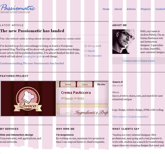
The Passiomatic home page with a superimposed 12 columns grid.
The home page is often the most challenging page of a site and Passiomatic is no exception. In fact the home page has a number of different information elements to be presented in decreasing order of importance. Once a grid is created with contents in mind it will assist the designer in positioning such elements on the page. Let’s see how:
- Logo and navigation menu share the top vertical space, spanning across the 12 colums and 3 lines of text (60px). Note how the logo height is 60px too.
- Latest published article is 8 and 6 columns for heading, subheading and the first article paragraph respectively. The remaining 2 columns under the subheading is used to shown publishing date, article topic and a comment counter.
- The about blurb requires less space thus the remaining 4 columns (140px) and 7 lines of text (140px) suffice. Again, note how the picture is cropped to the same dimensions.
- Featured project takes all the 12 columns (8 for the screenshot, 4 for the project information), and 10–11 lines of text (200–220px) since descriptions may vary in length.
- The three sections with very short texts at the bottom of the page call for a narrower paragraph width of 3 columns, 13 lines of text each (260px). Sections are positioned side by side.
Pixel height for each text element has been calculated starting from chosen line-height. More about this on the next section.
Generally speaking the more heterogeneous in size is the material to assemble the more flexible should be the grid to employ. In the case of Passiomatic a 12 columns grid provides enough variation to position all the needed elements.
Picking type size and line-height
As written previously a grid is defined by a number of columns and rows.
Each of the 12 columns of Passiomatic is 60px wide, plus there are 11 margins of 20px each. This gives a grand total of 940px:
(60px × 12) + (20px × 11) = 940px
Rows are created by setting a vertical rhythm. This is more tricky and requires to pick a comfortable font size and line-height — or leading in traditional typography — for the body text.
In Passiomatic the body font is set to 13px Georgia with a 20px of line-height. So 20px (or 20/13 ≈ 1.5em) becomes the vertical rhythm unit, which is used to set vertical dimensions like paddings, margins, etc. of the page elements.
These font settings combined with the 6 columns used for long passages of text — like the one you are reading — make lines containing an average of 10 words, which according to Muller-Brockmann, is the ideal width for a paragraph with a regular leading.
A word of warning
The dynamic, fluid, fast-paced nature of the the web makes difficult and admittedly not practical to impose a rigid vertical grid to all elements of the page. Richard Rutter’s article Compose to a Vertical Rhythm gives a detailed explanation of the number of calculations and caveats involved in achieving a pixel-perfect vertical rhythm in web design.
In my projects I try to maintain a vertical rhythm without becoming too obsessive about it. I’m usually more concerned to maintain a coherent rhythm between heading, subheading and paragraphs of a single text column, instead of trying to perfectly align elements across different columns.
Use the framework, Luke
Recently we have seen the rise of a number of CSS frameworks like Blueprint which greatly simplify and streamline the usage of grids on the web. Jeff Croft has written several articles on describing the rationale behind the CSS frameworks. However there were some people who fiercely argued against his points. It turned out that few people are scared by CSS frameworks while other reject them altogether.
It’s worth pointing out that Blueprint — and I guess others CSS frameworks too — is highly modular. This means that you can break Blueprint into pieces and take what you want from it. In fact I’ve designed and coded several web sites using only two modules of the original Blueprint: reset.css and grid.css. The actual grid has even been customized using Blueprint Grid Generator.
Breaking the grid
In closing I would like to point out that grids are not meant to be rigid. In fact once a designer has a grid in place she can achieve a great effect be breaking it consciously.